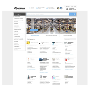
Contorion
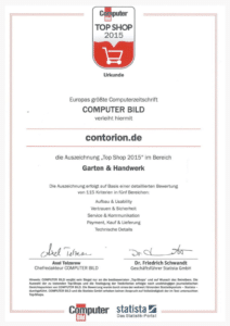
Contorion is an online store for industrial and trade supply, awarded for best Usability in 2015, by Computer Bild and Statista.
As the Lead UX/UI Designer at Project A Ventures, a German VC, I conducted user surveys, created prototypes, and designed the website, landing pages, and the Contorion logo.
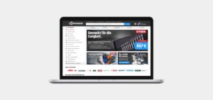
The smart shop for craftsmen
Contorion is an online store for industrial and trade supply. The extensive assortment covers a wide range of product categories. It serves professionals in commerce and industry with more than 300,000 products. The objective was to save time for the customers when ordering products for ongoing projects, as until then, ordering supplies was a catalog and B&M business only.
Winning a usability award, best practice pattern validate with real users
Create intuitive simple and beautiful interface, Create smooth user experience in any device, Increase the usage delight, Make it brandable, Make it performant, Make it scalable
UX / UI Designer at this Project with other Design colleagues. Wireframes, Prototypes, Handover to frontend developer, UI, UX, Logo Design
Scribbles, Wireframes, Paper Prototype, HTML Prototype, Sketch, Invision App, Jira, Confluence
Project flow
The starting position, which was the source of the business idea, was amazon supply. The objective was to display an assortment, comparable to the Würth catalog (Germany’s largest catalogs for craftsman supply) online for B2B & B2C).
We faced the challenge that we already had a website live that did not generate any B2B- sales and communication to the desired target group. We analyzed the market and competition with the team consisting of product managers, developers, designers, and founders.
This project followed the lean startup approach, where the focus is not on a long planning phase but a learning-by-doing and by “bringing the product to market” at an early stage.
Based on preliminary work from the founders of Contorion to define the core target groups, me and a product manager sharpened the target groups’ definition. A challenge at Contorion was that both B2B and B2C target groups interacted on the same platform, which we considered within the entire project.
Primary target group B2B:
Male 30+, construction industry, responsible buyers.
Secondary target group B2C:
Male 30+, familiar with hardware stores, interested in DIY, experienced with building materials.
Structuring and developing the information architecture and information offer into a meaningful subdivision of the contents and visualizing the navigation paths by the visualization of user-flows.
We used a problem solving and derivative approach used at Contorion. With the problem-solving method, we were able to identify issues and create solutions during several Design Thinking Workshops. We have firmly adhered to existing patterns that work in the market and adopted them with the derivative technique.
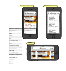
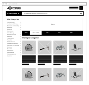
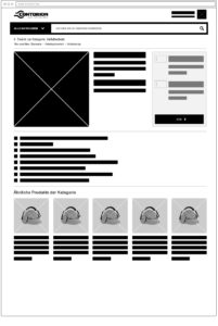
Through the competition analysis and compiled solutions and best practice patterns, first scribbles were created and agreed upon by the team. After several iterations, a pattern emerged with which we went further into the prototype phase. This prototype was created in collaboration with a front-end developer and tested on users in a real environment
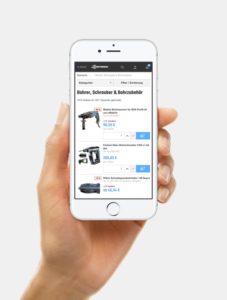
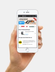
Contorion was designed in fully responsive, the primary focus is on tablet and desktop. The core target group does not make the purchase decision spontaneously, but in response to demand. The mobile site is more informative and promotes a later purchase decision.
Based on the tested prototypes, I created the first designs. Within Invision, they were commented on by the project team, which led to further improvements to the layouts.
Further adjustments were made until we achieved the final design, with which we wanted to go live. These adjustments included, for example, more surfaces for teasers, through product sliders on the welcome-page. With go-live, I handed over all designs to the Contorion design team.
The designs were handed over to the front end developers using the Invision-App. As the release timeline was very tight, I conducted a close collaboration, daily exchanges, and managed all stakeholders to bring this project to success.
Focus on navigation via category or direct search entries
The navigation’s main focus was to use clear categories to structure the extensive product range through card sorting by real users. As we found out through interviews with experts, many products are searched directly via a GTIN, EAN, and article number to go straight to the desired and searched SKU (No browsing and inspiration but focused buying).
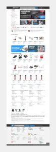
Development of the iteration
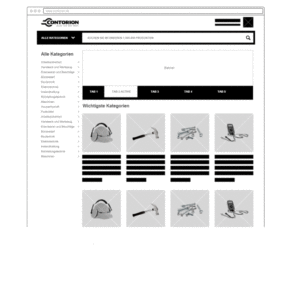
The development of the design iteration is animated here from the wireframe to the first designs to the final design.
Logo design and color scheme
Together with my team, we created different logo variants and a high-contrast color scheme for Contorion. The logo was deliberately chosen in the typography Bold, the stylized wrench that reshapes the C as part of the brand to emphasize the theme.

